First off, as many of you may have realized, it has been a long time since I’ve been maintaining this blog (almost 1⁄2 a year). This was because over the past few months, I’ve officially began my college career in the University of California, Los Angeles (UCLA). It has been an absolutely whirlwind of work and fun, and thus, I didn’t have much time left to write for the blog. Now, since everything has settled down a lot more, I’m going to be back up and running!
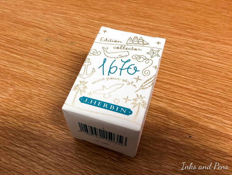
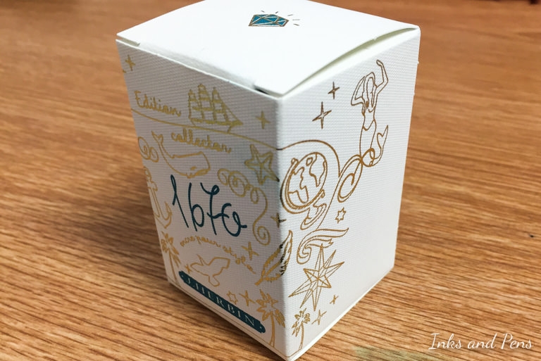
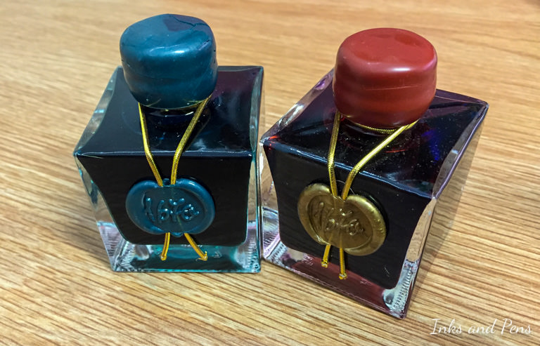
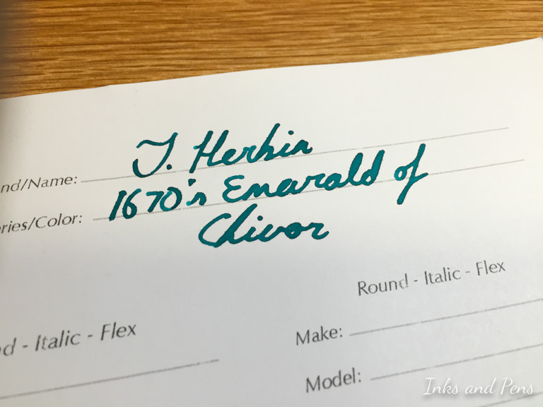
Anyways, for my re-entrance back into reviews, I present one of my favorite inks of all time, J. Herbin’s 1670 Emerald of Chivor. This is the fourth ink in the 1670 series of inks with gold sparkles mixed in. The first three were Stormy Gray, Rouge Hematite, and Bleu Ocean in that order.
Note that pictures were taken with an iPhone 6, and have been edited to ensure color accuracy of the subject, not the background. Although certain aspects of the image may look off-color, the ink color is true to life on a well-calibrated monitor.
For a little introduction, in the middle of the 16th century, European Conquistadors discovered large Columbian Emerald mines, the most famous being those in Chivor. The Emeralds from the Chivor mine were known for their blue-ish tint, and were highly sought after in European courts.
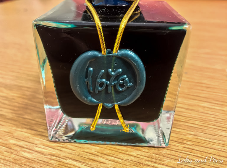
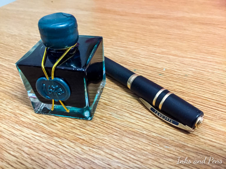
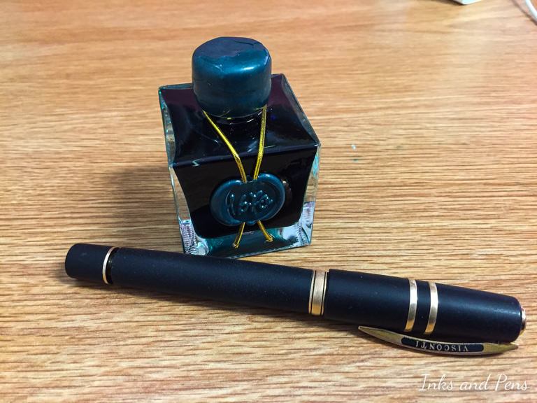
Well, that should be enough of a history lesson for now. Let’s dive right into the review. The bottle is the same bottle as all other 1670 inks like Rouge Hematite—a somewhat square glass bottle with a “wax” seal on the front and matching cap. The neck is as thin as the other bottles, so dipping a large pen in, like the Visconti HS Bronze is a challenge. I recommend decanting a bit of the ink into a separate ink vial or tube to make life easier.
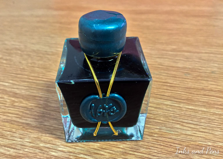
Here is the bottle together with Rouge Hematite, as well as some pictures of it with the Visconti HS Bronze. The bottle itself is quite hefty and solidly made. It’s definitely a display piece, so I like to display it front and center.
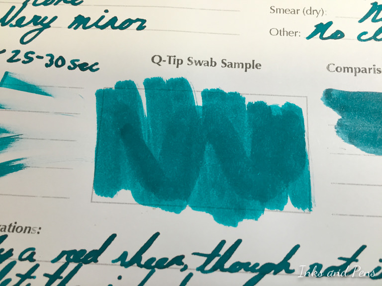
Here is the light swab of the ink. It is a definitely a blue-green color, bordering on teal. With the swab, you can see the amount of shading as I use a light swab for the background and a slightly heavier swab for the center streak.
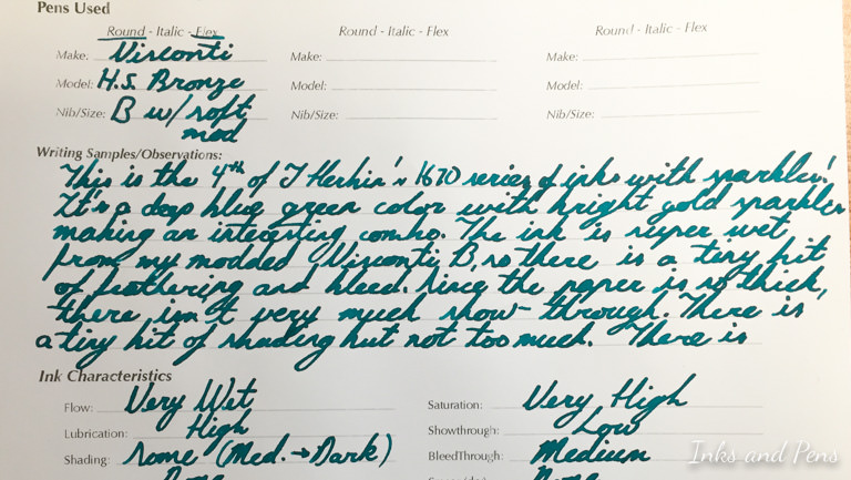
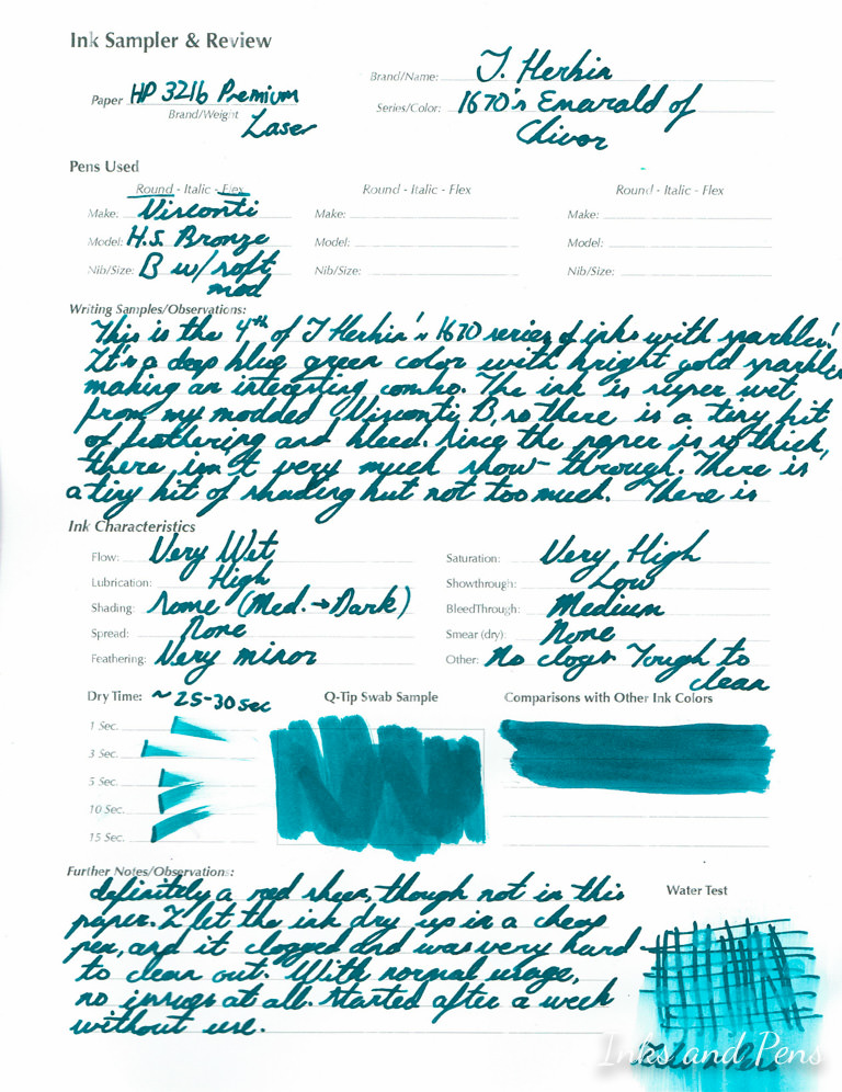
Here is the entire page of the review, with more details on each section in the paragraphs below. Use this to get an overview of what an entire page of an ink looks like.
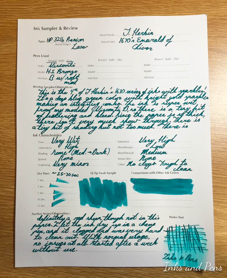
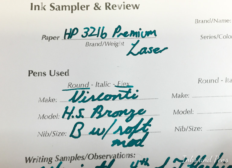
The review was done on HP 32lb Premium Laser Paper with a Visconti Homo Sapiens Bronze Age pen with a Broad nib that has modified for extra spring and wetness. As you probably realized by now, the ink for this review is J. Herbin’s Emerald of Chivor (Emerald de Chivor)
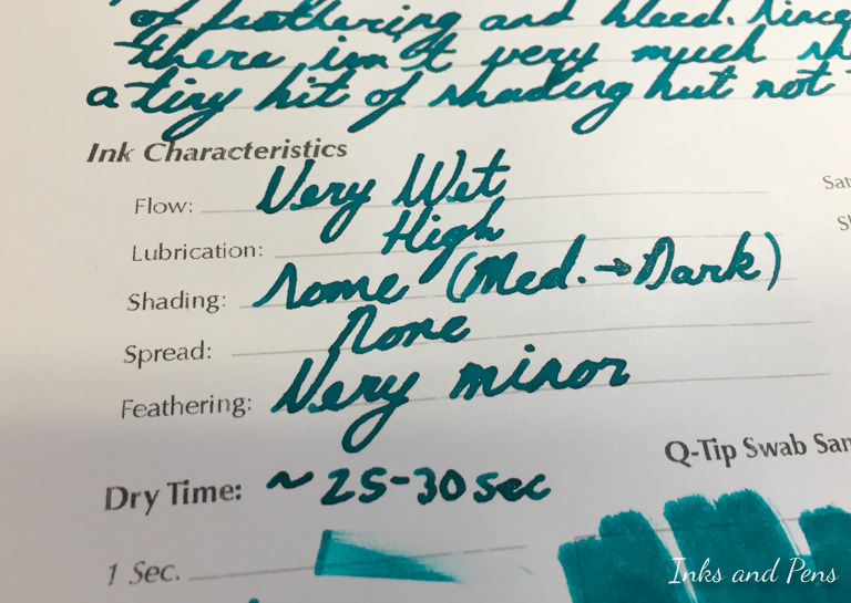
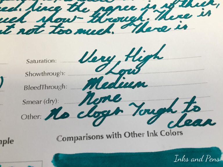
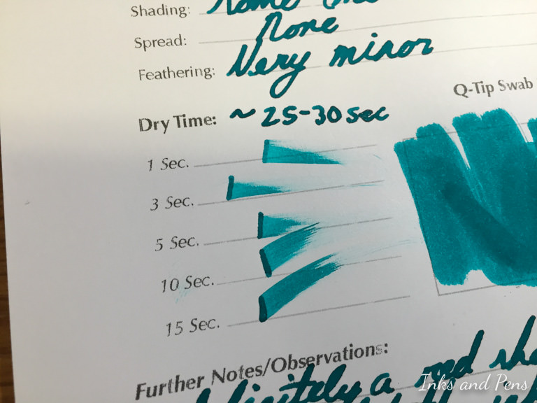
I’ll start with the basic characteristics of this ink. First off, it is very wet, coming out of this modified nib. Compared to other inks from this pen, this one is a lot wetter. Due to the ink’s wetness, it is extremely lubricating and provides a very smooth ride for the nib. There is a little bit of shading as you can see from the previous swab and certain portions of the writing. The shading tends to go from a medium-light hue to a most darker and pronounced shade. There is no spread of the ink on this paper; however, the ink does present with a small amount of feathering on the fringes of the letters. The feathering isn’t very severe, and is really not an issue.
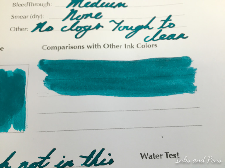
Like the J. Herbin claims, this ink is extremely saturated, and is a very vibrant color in the right lighting. Despite being very saturated, the ink doesn’t show through too much on this paper (probably because of how thick it is). Since the pen I’m using is so wet, there is definitely an noticeable amount of bleed through. It’s not a deal-breaker by any means, but it’s there. The ink doesn’t smear when it’s completely dry, except for the occasional loss of a gold sparkle.
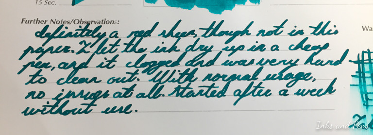
This ink contains very small gold flakes, giving the ink it’s signature sheen. However, these gold flakes essentially accumulate in your pen when it is not in use. Therefore, I recommend that you do not let your pen dry out completely due to prolonged neglect. I have tested leaving a Jinhao X450 to dry out until all that was left was caked-on ink. The resulting dried ink was extremely difficult to remove from the feed, even after multiple soaks in water, and vigorous shaking with soap and water. As well, the converter appears to have gold flakes permanent accumulated along the lip between the “piston” mechanism and plastic casing. However, with normal use of the pen, I have not had any problems with clogging or hard starts. Even after a week of not touching my Visconti HS Bronze, the pen started right up without hesitation. I did wiggle then pen around for a couple seconds beforehand, just to get an even distribution of the gold flakes throughout the ink.
The dry time for this ink is a bit long, which has been inevitably exaggerated by this choice of nib. The ink takes 25-30 seconds to fully dry, sometimes extending up to a minute on Tomoe River paper.
The color of this ink is extremely comparable to that of Sailor’s Jentle Yama-Dori as seem in the swab below. The color is practically identical, with Yama-Dori being a very small bit bluer. If you like the color of Emerald of Chivor, but worry about the gold sparkles, Yama-Dori is the way to go.
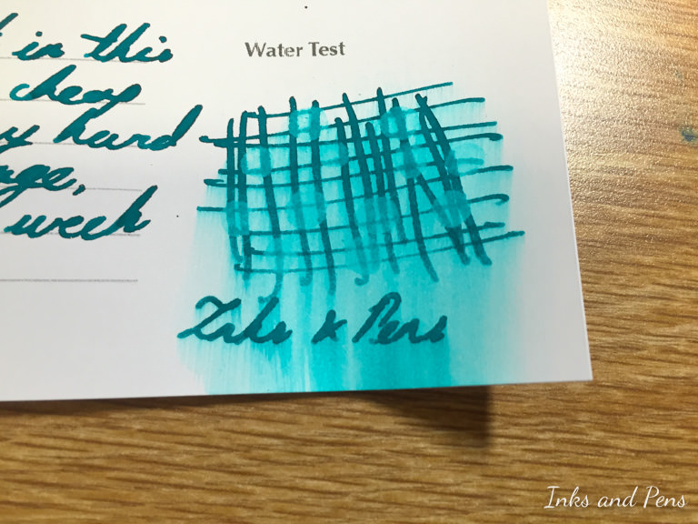
This ink, like other J. Herbin ones, are not waterproof at all. The grid below had a bunch of water droplets on it for about 30 seconds, then wiped off with a paper towel. There is a huge amount of smearing and most of the ink that contacted the water had lifted. There is still a faint line, but it did not fare well against water at all.
Here, you can see the amount of bleed-through that I previously mentioned in the characteristics above. Personally, I don’t find this to be very bothersome, but it could be a pet-peeve for some.
Below are close-ups of the two paragraphs, that basically summarized the previous thoughts of the ink.
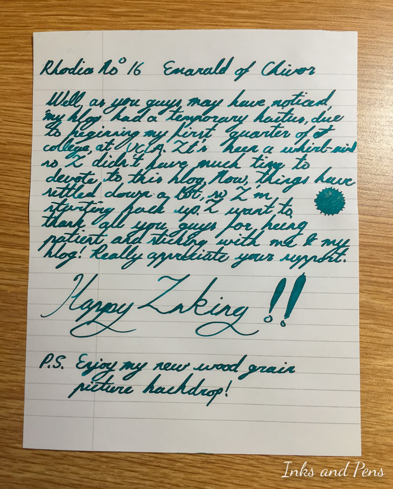
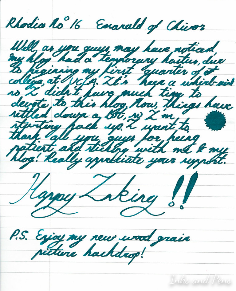
I also tried the ink on a Rhodia No. 16 Pad, just to see if it would make any real difference. I used the same pen and nib, so that was a constant.
I did notice that there was no feathering on the Rhodia, but greatly increased show through and bleed through. The last two are practically unavoidable, considering the paper is only 20#, as opposed to 32# like the HP. The Rhodia also brought out the sheen of the ink a lot more, compared to the HP 32lb.
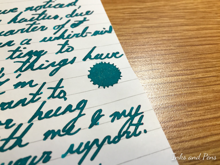
Here is a close-up of the cool-looking ink splatter I made by accident.
Here are the scans of both sheets for the reviews.
That’s a wrap folks! What you guys tried this ink already? What do you think about it? Does this new review format work well? Let me know down below in the comments!